On this page
Example: build custom component of standard RWC UI components
When standard input components do not provide functionality needed for a specific cases, the Custom template input component is the best way to add required functionality. To ease development, you can use default UI components used in standard input components like OrWebButton, OrWebCheckboxGroup, OrWebImageWrapper and etc. These components include additional RWC-specific logic and default appearance.
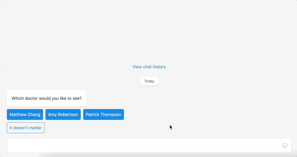
In this example, we will build enhanced Quick reply buttons component extended with additional preview tooltip for each button.
- To create a list of buttons, we need to come up with the structure. For this example the structure of buttons will be the following:
js
[{
  label: 'Matthew Chang', // label on the button
  id: 1, // id of a button/doctor
  position: 'Specialist', // doctor position
  isVerified: true, // is doctor verified specialist
  imageUrl: 'https://image.shutterstock.com/image-photo/cheerful-mature-doctor-posing-smiling-260nw-1384243295.jpg', // doctor image
  buttonStyle: 'filled' // button style
}]
[{
label: 'Matthew Chang', // label on the button
id: 1, // id of a button/doctor
position: 'Specialist', // doctor position
isVerified: true, // is doctor verified specialist
imageUrl: 'https://image.shutterstock.com/image-photo/cheerful-mature-doctor-posing-smiling-260nw-1384243295.jpg', // doctor image
buttonStyle: 'filled' // button style
}]- Next, we need to create vue template for our component. In this case we will use:
OrWebButton- RWC button;OrWebImageWrapper- RWC image wrapper, allows to show default placeholder if image is loading;OrWebIcon- RWC icon, allows to render Google Material Icons.
Vue template
html
<div class="rwc-enhanced-quick-reply-buttons">
  <div
    class="rwc-ehanced-button-container"
    v-for="doctor in doctors"
    :key="doctor.label"
  >
    <div class="rwc-ehanced-button-container__tooltip" v-if="doctor.imageUrl || doctor.position">
      <OrWebImageWrapper :src="doctor.imageUrl"/>

      <div v-if="doctor.position" class="rwc-ehanced-button-container__position">
        <span>{{ doctor.position }}</span>
        <OrWebIcon v-if="doctor.isVerified">verified</OrWebIcon>
      </div>
    </div>

    <OrWebButton
      :disabled="readonly || sendingButtonId !== null"
      :loading="sendingButtonId === doctor.id"
      @click="send(doctor.id)"
      :type="doctor.buttonStyle"
    >
      {{ doctor.label }}
    </OrWebButton>
  </div>
</div><div class="rwc-enhanced-quick-reply-buttons">
<div
class="rwc-ehanced-button-container"
v-for="doctor in doctors"
:key="doctor.label"
>
<div class="rwc-ehanced-button-container__tooltip" v-if="doctor.imageUrl || doctor.position">
<OrWebImageWrapper :src="doctor.imageUrl"/>
<div v-if="doctor.position" class="rwc-ehanced-button-container__position">
<span>{{ doctor.position }}</span>
<OrWebIcon v-if="doctor.isVerified">verified</OrWebIcon>
</div>
</div>
<OrWebButton
:disabled="readonly || sendingButtonId !== null"
:loading="sendingButtonId === doctor.id"
@click="send(doctor.id)"
:type="doctor.buttonStyle"
>
{{ doctor.label }}
</OrWebButton>
</div>
</div>As you can see above we define the .rwc-enhanced-quick-reply-buttons parent class. It wraps buttons list for correct margins inside the chat. Inside this container, we render multiple buttons that are wrapped in .rwc-ehanced-button-container div which holds the RWC button and the tooltip. The tooltip will be shown on button hover. The tooltip will contain OrWebImageWrapper component for a doctor image and OrWebIcon.
SCSS:
css
.rwc-enhanced-quick-reply-buttons {
  display: flex;
  flex-wrap: wrap;
  width: 100%;
  margin-top: -8px;

  .rwc-ehanced-button-container {
    margin-top: 8px;
    margin-right: 8px;
    line-height: 16px;
    position: relative;

    &__tooltip {
      position: absolute;
      bottom: 100%;
      z-index: 10;
      left: 50%;
      transform: translateX(-50%) translateY(-16px);
      padding: 16px;
      background: rgba(0, 0, 0, 0.8);
      border-radius: 8px;
      width: 150px;
      display: none;
      z-index: 2;
      flex-direction: column;
      align-items: center;

      &::after {
        content: "";
        position: absolute;
        top: 100%;
        left: 50%;
        margin-left: -5px;
        border-width: 5px;
        border-style: solid;
        border-color: rgba(0, 0, 0, 0.8) transparent transparent transparent;
      }

      .or-web-media-image-wrapper {
        border-radius: 50%;
        overflow: hidden;
        width: 100px;
        height: 100px;
        margin-bottom: 16px;
      }
    }

    &__position {
      display: flex;
      align-items: center;
      color: #fff;
      justify-content: center;

      .or-web-icon {
        margin-left: 8px;
      }
    }

    &:hover .rwc-ehanced-button-container__tooltip {
      display: flex;
      animation: appear;
      animation-duration: 0.3s;
    }

    @keyframes appear {
      from {
        opacity: 0;
        bottom: calc(100% + 16px);
      }

      to {
        opacity: 1;
        bottom: 100%;
      }
    }

    &:last-child {
      margin-right: 0;
    }
  }
}
.rwc-enhanced-quick-reply-buttons {
display: flex;
flex-wrap: wrap;
width: 100%;
margin-top: -8px;
.rwc-ehanced-button-container {
margin-top: 8px;
margin-right: 8px;
line-height: 16px;
position: relative;
&__tooltip {
position: absolute;
bottom: 100%;
z-index: 10;
left: 50%;
transform: translateX(-50%) translateY(-16px);
padding: 16px;
background: rgba(0, 0, 0, 0.8);
border-radius: 8px;
width: 150px;
display: none;
z-index: 2;
flex-direction: column;
align-items: center;
&::after {
content: "";
position: absolute;
top: 100%;
left: 50%;
margin-left: -5px;
border-width: 5px;
border-style: solid;
border-color: rgba(0, 0, 0, 0.8) transparent transparent transparent;
}
.or-web-media-image-wrapper {
border-radius: 50%;
overflow: hidden;
width: 100px;
height: 100px;
margin-bottom: 16px;
}
}
&__position {
display: flex;
align-items: center;
color: #fff;
justify-content: center;
.or-web-icon {
margin-left: 8px;
}
}
&:hover .rwc-ehanced-button-container__tooltip {
display: flex;
animation: appear;
animation-duration: 0.3s;
}
@keyframes appear {
from {
opacity: 0;
bottom: calc(100% + 16px);
}
to {
opacity: 1;
bottom: 100%;
}
}
&:last-child {
margin-right: 0;
}
}
}- Now let's to define our logic.
Vue script:
js
return {
  template: {
    props: {
      readonly: {
        type: Boolean,
        default: false
      }
    },

    data() {
      return {
        sendingButtonId: null
      }
    },

    computed: {
      doctors() {
        return [{
          label: 'Matthew Chang',
          id: 1,
          position: 'Specialist',
          isVerified: true,
          imageUrl: 'https://image.shutterstock.com/image-photo/cheerful-mature-doctor-posing-smiling-260nw-1384243295.jpg',
          buttonStyle: 'filled'
        }, {
          label: 'Amy Robertson',
          id: 2,
          position: 'Intern',
          isVerified: false,
          imageUrl: 'https://image.shutterstock.com/image-photo/young-smiling-female-doctor-stethoscope-260nw-1915535233.jpg',
          buttonStyle: 'filled'
        }, {
          label: 'Patrick Thompson',
          id: 3,
          position: 'Specialist',
          isVerified: true,
          imageUrl: 'https://image.shutterstock.com/image-photo/covid19-coronavirus-outbreak-healthcare-workers-260nw-1933145801.jpg',
          buttonStyle: 'filled'
        }, {
          label: 'It doesn\'t matter',
          id: '__any_doctor__',
          buttonStyle: 'outlined'
        }]
      }
    },

    methods: {
      send(id) {
        this.sendingButtonId = id;

        const doctor = _.find(this.doctors, { id });

        this.sendMessage({
          message: doctor.label,
          doctorId: doctor.id,
          label: doctor.label
        })
          .catch(e => {
            console.error(e);
            this.sendingButtonId = null;
          });
      }
    }
  }
}
return {
template: {
props: {
readonly: {
type: Boolean,
default: false
}
},
data() {
return {
sendingButtonId: null
}
},
computed: {
doctors() {
return [{
label: 'Matthew Chang',
id: 1,
position: 'Specialist',
isVerified: true,
imageUrl: 'https://image.shutterstock.com/image-photo/cheerful-mature-doctor-posing-smiling-260nw-1384243295.jpg',
buttonStyle: 'filled'
}, {
label: 'Amy Robertson',
id: 2,
position: 'Intern',
isVerified: false,
imageUrl: 'https://image.shutterstock.com/image-photo/young-smiling-female-doctor-stethoscope-260nw-1915535233.jpg',
buttonStyle: 'filled'
}, {
label: 'Patrick Thompson',
id: 3,
position: 'Specialist',
isVerified: true,
imageUrl: 'https://image.shutterstock.com/image-photo/covid19-coronavirus-outbreak-healthcare-workers-260nw-1933145801.jpg',
buttonStyle: 'filled'
}, {
label: 'It doesn\'t matter',
id: '__any_doctor__',
buttonStyle: 'outlined'
}]
}
},
methods: {
send(id) {
this.sendingButtonId = id;
const doctor = _.find(this.doctors, { id });
this.sendMessage({
message: doctor.label,
doctorId: doctor.id,
label: doctor.label
})
.catch(e => {
console.error(e);
this.sendingButtonId = null;
});
}
}
}
}In this logic, we define buttons list that will be shown as a list and a method for submitting buttons and sending message. You can see result in the GIF above.
TIP
Note, that for processing you can use loading prop, but in this example we've built our custom loading logic.
TIP
Output example will be:
js
{
  doctorId: '',
  label: ''
}
{
doctorId: '',
label: ''
}As we defined in the sendMessage method.